Illinois Casualty Company
Transforming an outdated insurance experience into a modern digital product, end to end.
An outdated site serving two very different audiences
I took this on as a freelance contractor in early 2021, with no fixed role on the project, the scope was mine to define. Illinois Casualty Company's site had two distinct audiences that needed to coexist without stepping on each other: insurance agents, who needed their own login area, and policy holders, who needed a full claims system. The existing site served neither well.
Auditing before redesigning
The project started with a full UX/UI audit; performance, accessibility, best practices, SEO, responsive behavior, interface, and experience, run against the live site using Lighthouse. The scores made the case on their own: a Performance score of 9 out of 100, Accessibility at 78, Best Practices at 79, and SEO at 83, alongside a first impression review that found no empathy in the experience, no clear message or storytelling, an inconsistent interface, and no clear way to contact the company.
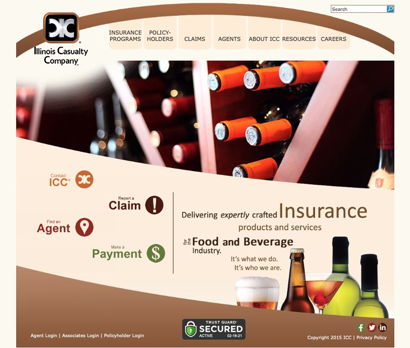 Before — the original homepage
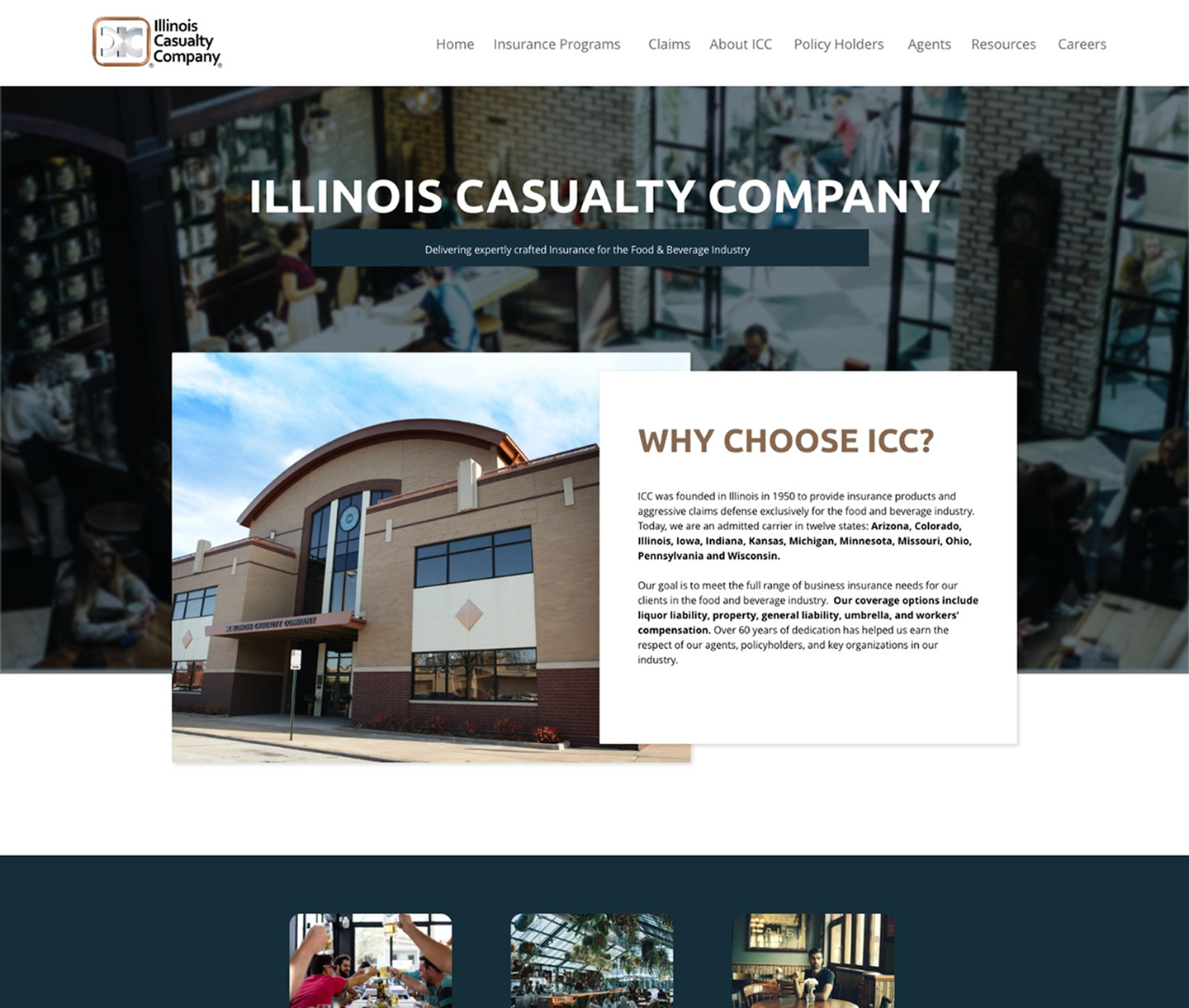
After — the redesigned homepage
Restructuring the sitemap around two audiences
The original sitemap buried agent and policy holder logins inside a generic footer, and spread insurance program categories across a sprawling, flat structure. The redesign consolidated navigation around the two real audiences, moved agent and policy holder logins to top level access points, and folded scattered "About" content (compliance notices, annual reports, corporate citizenship) into a cleaner structure, while keeping every one of ICC's specific insurance program categories intact.
From there, the work covered wireframes, visual design, a full style guide, and experience flows designed separately for agents and for policy holders, followed by front end development and handoff to the team implementing backend features.
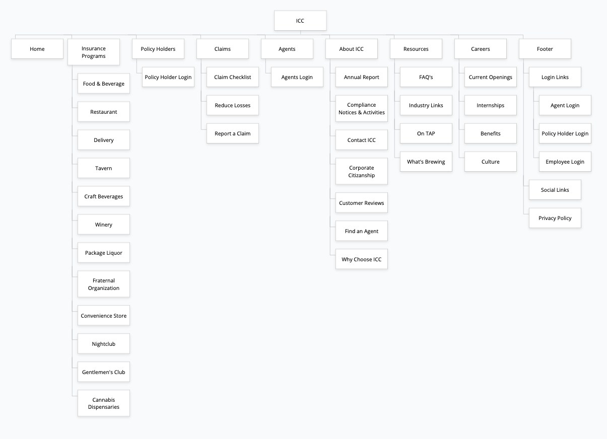 Old sitemap — logins buried in the footer
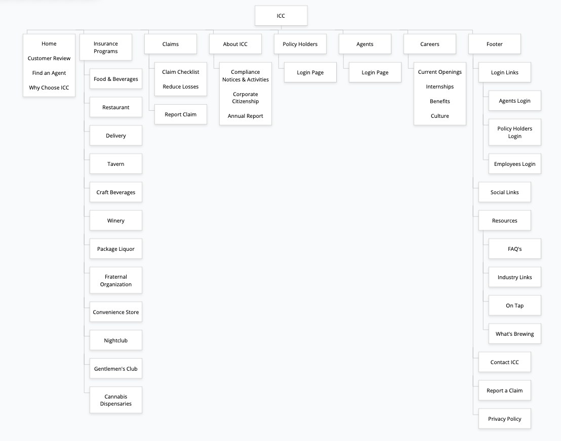 Proposed sitemap — agent and policy holder logins promoted to top level
The policy holder experience was one of the clearest before/after moments in the project, from a dense, brand inconsistent login buried under a generic menu, to a focused, on brand login screen with clear next actions.
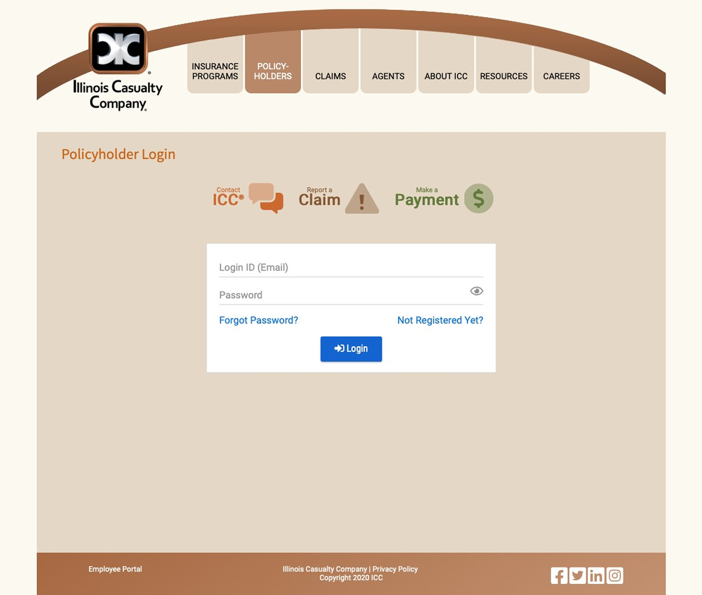 Before — policy holder login
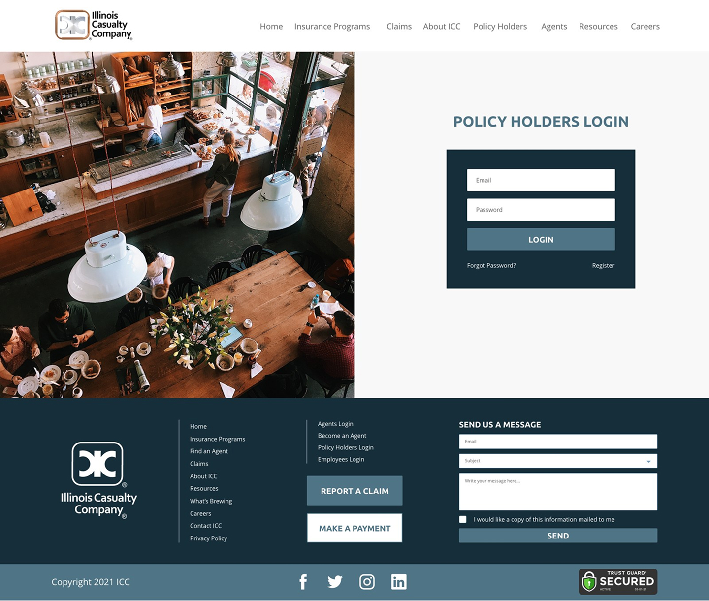 After — policy holder login
Measured improvement, and five years of staying power
Google Lighthouse scores, before the redesign and at handoff (June 2021).
The redesign launched in August 2021. The current live site has barely changed in the five years since, which, for a structural and experience redesign, is a good indicator that it's still doing its job.
What this project reinforced
This was one of the projects that most reinforced my end to end capabilities, audit, research, information architecture, style guide, experience design for two distinct user types, and the front end build itself, delivered directly into a dev team's hands for backend implementation. Freelance work like this, without a large team around me, is where I learned to own a project's full arc rather than one slice of it.